Welcome, Guest |
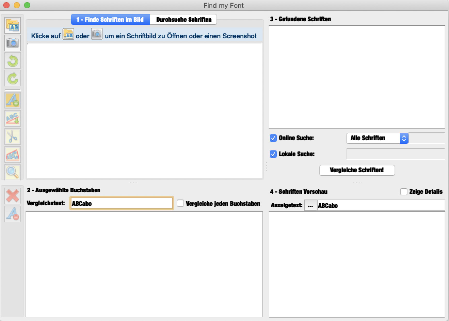
| Hello! For a while now, the Find my Font interface has changed. The font used for buttons and descriptions has been changed to a hard-to-read bold condensed font. See screenshot attached. Why does this problem occur? How can I fix it? Thanks for any help! Dirk |
Please Log in or Create an account to join the conversation. |

| BUMP. I have had the same problem for years and have lived with it. Excited for an all-new update to the app, but is there anything I can do in the meantime to fix this? It seems like it's an issue when I activate a version of Helvetica on my system...then it goes all wonky. Also, the interface itself has been extremely blurry for years. Is that just how it is in this release, or is there something I can do to fix it? |
Please Log in or Create an account to join the conversation. |
| I have had the same problem for years and have lived with it. Excited for an all-new update to the app, but is there anything I can do in the meantime to fix this? It seems like it's an issue when I activate a version of Helvetica on my system...then it goes all wonky.The GUI system of cur. release is really old and depends on some system fonts and the way the macOS find "the best" replacement font if the exact font is not found. I don't think we can do something with the current release. In the new release we 'll try -if possible- to pack the associated fonts within the application bundle. Also, the interface itself has been extremely blurry for years. Is that just how it is in this release, or is there something I can do to fix it?Which parts of the GUI are blurry? Could you post some images here or send us an email to This email address is being protected from spambots. You need JavaScript enabled to view it., mentioning also the exact version of your macOS and the version of Find my Font you are running? Fivos Vilanakis - Softonium Developments CTO |

Please Log in or Create an account to join the conversation. Fivos Vilanakis - Softonium Developments CTO Last edit: by fivos. |
| Hi! I am trying to upload an image to show you what I am talking about, but your forum file size restrictions won't allow me. If you refer to the image in the first post in this thread, posted by dklotz, it's very similar to what I am seeing. My fonts are all extremely bold and italicized (the closest thing I have is Helvetica Neue Black Italic). But all of the icons are low-res, the text everywhere is antialiased so it's blurry, and even the text in the main header of the window itself has always been blurry. I assume this is because it was built for a much older operating system. It doesn't make it unusable, but certainly does not display as cleanly as more modern apps do. I look forward to your new version! Thank you for taking time to reply. Much appreciated. |
Please Log in or Create an account to join the conversation. |